Announcement Bar
The Announcement Bar addon allows you to display a notification bar at the top of your website to inform your users about news, promotions, or important alerts.
This addon requires ClientXCMS version v2.14.9 or higher.
Configuration
You can manage the announcement bar configuration in Admin Panel > Settings > Customizations > Announcement Banner
Banner HTML: You can add HTML in the text field to customize the announcement bar content. Display Start: You can set the start date and time for the announcement bar display. Display End: You can set the end date and time for the announcement bar display. Enable Banner: You can enable or disable the announcement bar.
Make sure the theme you are using supports the announcement bar display. Some custom themes may not display this feature.
How to support the addon on a theme?
For the announcement bar to display correctly, your theme must include the following code in your layouts/client.blade.php or layouts/front.blade.php file or equivalent, right after the <body> tag:
{!! app('seo')->header() !!}
Announcement bar display examples:
- Example 1
- Example 2
- Example 3
- Example 4
Preview:
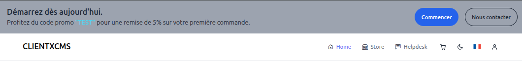
Source code:
<div class="bg-gray-400 backdrop-blur-lg dark:bg-neutral-900/60">
    <div class="max-w-[85rem] px-4 py-4 sm:px-6 lg:px-8 mx-auto">
        <!-- Grid -->
        <div class="grid justify-center sm:grid-cols-2 sm:items-center gap-4">
            <div class="flex items-center gap-x-3 md:gap-x-5">
                <div class="grow">
                    <p class="md:text-xl text-gray-800 font-semibold dark:text-neutral-200">
                        Get started today.
                    </p>
                    <p class="text-sm md:text-base text-gray-800 dark:text-neutral-200">
                        Use promo code <span class="font-semibold text-primary">"TEST"</span> for a 5% discount on your first order.
                    </p>
                </div>
            </div>
            <div class="text-center sm:text-start flex sm:justify-end sm:items-center gap-x-3 md:gap-x-4">
                <a class="py-3 px-4 inline-flex items-center gap-x-2 text-sm font-semibold rounded-full border border-transparent bg-blue-600 text-white hover:bg-blue-700 disabled:opacity-50 disabled:pointer-events-none" href="/store">
                    Get Started
                </a>
                <a class="py-3 px-4 inline-flex items-center gap-x-2 text-sm font-semibold rounded-full border border-gray-800 text-gray-800 hover:border-gray-500 hover:text-gray-500 disabled:opacity-50 disabled:pointer-events-none dark:border-white dark:text-white dark:hover:text-neutral-300 dark:hover:border-neutral-300" href="/client/support/submit">
                    Contact Us
                </a>
            </div>
        </div>
    </div>
</div>
<div class="bg-emerald-500 rounded-lg">
    <div class="max-w-7xl px-4 py-4 sm:px-6 lg:px-8 mx-auto">
        <div class="flex flex-col sm:flex-row items-center justify-between gap-4">
            <div class="flex items-center gap-3 text-center sm:text-left">
                <svg class="w-6 h-6 text-white hidden sm:block" fill="none" stroke="currentColor" viewBox="0 0 24 24">
                    <path stroke-linecap="round" stroke-linejoin="round" stroke-width="2" d="M13 16V6a1 1 0 00-1-1H4a1 1 0 00-1 1v10a1 1 0 001 1h1m8-1a1 1 0 01-1 1H9m4-1V8a1 1 0 011-1h2.586a1 1 0 01.707.293l3.414 3.414a1 1 0 01.293.707V16a1 1 0 01-1 1h-1m-6-1a1 1 0 001 1h1M5 17a2 2 0 104 0m-4 0a2 2 0 114 0m6 0a2 2 0 104 0m-4 0a2 2 0 114 0"></path>
                </svg>
                <div>
                    <p class="text-white font-semibold text-lg">
                        Free setup fee on orders over €50
                    </p>
                    <p class="text-emerald-100 text-sm">
                        Take advantage before the end of the month
                    </p>
                </div>
            </div>
            <div class="flex gap-3">
                <a href="#" class="px-6 py-2 bg-white text-emerald-600 rounded-lg font-semibold hover:bg-emerald-50 transition-colors">
                    Discover
                </a>
                <button data-announcement-dismiss class="px-3 py-2 text-white hover:bg-emerald-600 rounded-lg transition-colors">
                    <svg class="w-5 h-5" fill="none" stroke="currentColor" viewBox="0 0 24 24">
                        <path stroke-linecap="round" stroke-linejoin="round" stroke-width="2" d="M6 18L18 6M6 6l12 12"></path>
                    </svg>
                </button>
            </div>
        </div>
    </div>
    </div>
Preview:

Source code:
<div class="relative bg-gradient-to-r from-purple-600 to-pink-600 rounded-lg">
    <div class="max-w-7xl px-4 py-3 sm:px-6 lg:px-8 mx-auto">
        <div class="flex items-center justify-between gap-4">
            <div class="flex items-center gap-3">
                <svg class="w-5 h-5 text-white" fill="none" stroke="currentColor" viewBox="0 0 24 24">
                    <path stroke-linecap="round" stroke-linejoin="round" stroke-width="2" d="M12 8v13m0-13V6a2 2 0 112 2h-2zm0 0V5.5A2.5 2.5 0 109.5 8H12zm-7 4h14M5 12a2 2 0 110-4h14a2 2 0 110 4M5 12v7a2 2 0 002 2h10a2 2 0 002-2v-7"></path>
                </svg>
                <p class="text-sm md:text-base text-white font-medium">
                    <span class="font-bold">Special Offer:</span> -30% on the entire Summer collection with code <span class="px-2 py-1 bg-white/20 rounded font-mono">ETE30</span>
                </p>
            </div>
            <button data-announcement-dismiss class="text-white hover:text-gray-200 transition-colors">
                <svg class="w-5 h-5" fill="none" stroke="currentColor" viewBox="0 0 24 24">
                    <path stroke-linecap="round" stroke-linejoin="round" stroke-width="2" d="M6 18L18 6M6 6l12 12"></path>
                </svg>
            </button>
        </div>
    </div>
</div>
Preview:
Source code:
<div id="bar5" class="bg-gradient-to-r from-orange-500 to-red-500 rounded-lg">
                <div class="max-w-7xl px-4 py-4 sm:px-6 lg:px-8 mx-auto">
                    <div class="flex flex-col lg:flex-row items-center justify-between gap-4">
                        <div class="flex items-center gap-4 text-center lg:text-left">
                            <svg class="w-8 h-8 text-white hidden lg:block" fill="none" stroke="currentColor" viewBox="0 0 24 24">
                                <path stroke-linecap="round" stroke-linejoin="round" stroke-width="2" d="M7 7h.01M7 3h5c.512 0 1.024.195 1.414.586l7 7a2 2 0 010 2.828l-7 7a2 2 0 01-2.828 0l-7-7A1.994 1.994 0 013 12V7a4 4 0 014-4z"></path>
                            </svg>
                            <div>
                                <p class="text-white font-bold text-xl">
                                    Exclusive offers of the moment
                                </p>
                                <div class="flex flex-wrap gap-2 mt-2 justify-center lg:justify-start">
                                    <span class="px-3 py-1 bg-white/20 backdrop-blur-sm text-white rounded-full text-sm font-semibold">
                                        WELCOME10 → -10%
                                    </span>
                                    <span class="px-3 py-1 bg-white/20 backdrop-blur-sm text-white rounded-full text-sm font-semibold">
                                        FIRST20 → -€20
                                    </span>
                                    <span class="px-3 py-1 bg-white/20 backdrop-blur-sm text-white rounded-full text-sm font-semibold">
                                        FREE50 → Free shipping
                                    </span>
                                </div>
                            </div>
                        </div>
                        <div class="flex gap-3">
                            <a href="#" class="px-6 py-3 bg-white text-orange-600 rounded-full font-bold hover:bg-orange-50 transition-colors shadow-lg">
                                Order now
                            </a>
                            <button data-announcement-dismiss class="p-3 text-white hover:bg-white/10 rounded-full transition-colors">
                                <svg class="w-5 h-5" fill="none" stroke="currentColor" viewBox="0 0 24 24">
                                    <path stroke-linecap="round" stroke-linejoin="round" stroke-width="2" d="M6 18L18 6M6 6l12 12"></path>
                                </svg>
                            </button>
                        </div>
                    </div>
                </div>
</div>
How to add a close button?
You can add a close button to the announcement bar using the following HTML and JavaScript code:
<button  type="button" data-announcement-dismiss><i class="bi bi-x-lg"></i></button>
<!-- or -->
<button type="button" onclick="clientxAnnouncementBarHide()"><i class="bi bi-x-lg"></i></button>